Accounts Receivable Dashboard Inside Salesforce
The Quick Receivable accounts receivable dashboard shows what customers owe, how much of it is late, how long cash takes to come in, and which accounts and invoices to chase first. It runs on your Salesforce data, so the numbers match the records your collectors already work in.
Book a Free Demo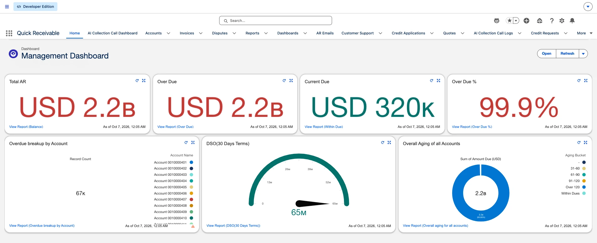
What the AR Dashboard Shows
The Management Dashboard is the AR dashboard your finance lead and collectors open first. It answers three questions in order. How much is owed? How much of it is late? Where should the team spend today? Four KPI tiles sit on top, three charts break the balance down, and two ranked tables point at the accounts and invoices that need action. Every component has a View Report link, so any number can be opened into the records behind it. The header shows the time of the last refresh, and the Refresh button pulls current figures on demand.
AR KPI Dashboard Tiles: Four Numbers That Set the Day
The top row is the AR KPI dashboard in its simplest form. Red means money that is late. Teal means money that is still within terms. If the red tiles grow week over week, collections are falling behind. These four tiles cover the core KPIs in accounts receivable that a controller checks before anything else.

The four KPI tiles at the top of the Management Dashboard
Total AR
The full open balance across every customer account. This is what your business is waiting to collect.
Over Due
The part of Total AR that has passed its due date. This is the number collections is measured against.
Current Due
Balances still within payment terms. Nothing to chase yet, but it shows what lands next.
Over Due %
Over Due divided by Total AR. One number that tells you how healthy the whole ledger is.
Overdue Breakup by Account
A total overdue number does not tell a collector who to call. This chart splits the late balance by customer account, with the record count in the center and each account listed in the legend.
So you can see right away if the problem sits with a few large customers or is spread thin across many. A few large accounts mean a few calls. A long tail means dunning should carry more of the work.
- Overdue balance grouped by customer account
- Total record count shown in the chart
- View Report opens the account level detail
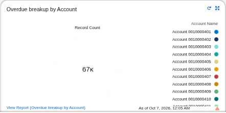
Overdue breakup by account with record count
DSO on the AR Metrics Dashboard
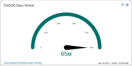
DSO gauge on 30 day terms
The gauge tracks days sales outstanding calculated on 30 day terms. It is the AR metrics dashboard view of how long cash sits in receivables before it reaches the bank.
Watch the needle over time, not on a single day. A rising DSO means customers are paying slower or late balances are piling up. If you want to test the math against your own numbers, the DSO calculator uses the same inputs.
- DSO shown on a gauge with a clear scale
- Calculated on 30 day payment terms
- Drill into the DSO report from the component
Accounts Receivable Aging Dashboard
The Overall Aging of all Accounts chart is the accounts receivable aging dashboard view. It shows the sum of amount due across every account, split into aging buckets.
The older the bucket, the lower the odds of getting paid in full. Balances sitting in Over 120 are the ones your finance team will look at when setting the allowance for doubtful accounts. If a single bucket fills the donut, that is where the team should focus this week.
The chart replaces the static accounts receivable aging reports that teams usually rebuild in a spreadsheet each month.
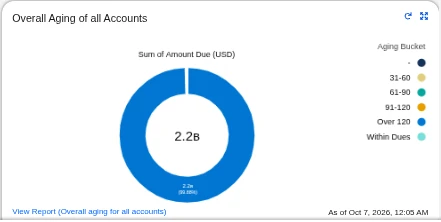
Overall aging of all accounts by bucket
Top Accounts by Amount Overdue
This table ranks customers by what they owe and shows how much of that balance is late. Total AR, amount due, within due, overdue percentage, and disputed amount sit on one row for each account. It is the receivable dashboard view a collections manager uses to hand out the day's work.

Top accounts ranked by amount overdue
Disputed amount sits next to the balance
An overdue balance that is fully disputed needs a different response than one that is just late. Showing the disputed amount on the same row stops collectors from sending a reminder on an invoice the customer is already contesting. Those accounts go to dispute management instead.
Overdue % shows how stuck an account is
Two accounts can owe the same amount. One with 68% overdue still pays part of its bill on time. One at 100% has stopped paying. The second account needs a call, and it may need a review of its terms under credit management.
Top 10 Invoices by Due Amount
Account totals tell you who to call. Invoice detail tells you what to say. This table lists the ten largest open invoices with the account name, invoice number, transaction number, invoice date, amount, amount due, due date, days past due, and aging bucket.

Top 10 invoices sorted by amount due
Invoice data comes from your ERP
Quick Receivable does not create invoices. They flow in from your ERP or accounting system, so the transaction number on the dashboard matches the source. Teams running SAP or QuickBooks see the same invoice references in both places.
Days past due and bucket on each line
A large invoice that is still within due needs a heads up. A large invoice at 445 or 643 days past due needs escalation. Seeing both on one list helps the team split the work between friendly reminders and harder conversations.
From the AR Dashboard to Collection Work
A dashboard that only reports is a scoreboard. This one sits inside the same Salesforce org where collectors send emails, log promises, and apply payments, so a number on screen turns into action in a few clicks.
Spot the problem
The KPI tiles and aging chart show where late money is building up.
Open the records
View Report drills from any chart into the accounts and invoices behind it.
Close it out
Payments are matched through cash application, and the dashboard reflects it on the next refresh.
One Dashboard for Accounts Receivable, Three Different Users
The same screen serves people with different jobs. It is the dashboard account receivable teams open each morning, and each role reads it for something different.
| Role | What they check | What they do next |
|---|---|---|
| CFO or Controller | Total AR, Over Due %, and DSO trend | Flags cash risk to leadership and reviews credit policy when DSO climbs |
| AR Manager | Top accounts by amount overdue, aging spread, disputed amounts | Assigns accounts to collectors and moves disputed balances to the right owner |
| Collector | Top invoices by due amount, days past due, aging bucket | Sends reminders, places calls, and records promises to pay on the invoice |
Accounts Receivable Dashboard Reporting in Salesforce
Quick Receivable is accounts receivable software built inside Salesforce, so the dashboard uses standard Salesforce reports and dashboards. There is no separate BI tool to buy, sync, or log into.
Each component is backed by a report your team can open, filter, and share. Your Salesforce admin can adjust components with the standard dashboard builder when the business wants a different view.
Every chart and table opens into its source report
Results by collector to see who is moving balances
Aging Bucket Current report available out of the box
Reports export to PDF or Excel for month end packs
Refresh on demand, with the last updated time on screen
AR Dashboards vs Spreadsheet Aging Reports
Most teams start with a spreadsheet export. It works until the ledger grows and the file is out of date by the time someone opens it.
| What you need | Spreadsheet export | Quick Receivable AR dashboard |
|---|---|---|
| Current numbers | As of the last export | Refresh on demand inside Salesforce |
| Drill into detail | Find the row, then look it up elsewhere | View Report opens the records |
| Disputes in view | Usually a separate tracker | Disputed amount on the same row |
| Next action | Switch tools to email or call | Same org as emails, calls, and promises |
| Month end pack | Rebuilt by hand | Export reports to PDF or Excel |
If your current setup is spreadsheets plus a shared inbox, this is usually the first place teams see a change. Clear visibility is the first step to reduce days sales outstanding.
Accounts Receivable Dashboards Beyond the Main View
The Management Dashboard covers the whole ledger. Two other accounts receivable dashboards go deeper into a single account and into call activity. You can see the full set on the Quick Receivable features page.
Management Dashboard
The full ledger view covered on this page, from Total AR down to the top ten invoices.
Customer Account Dashboard
Open an account and see its own numbers first, with invoices, payments, and disputes linked below.
AI Collection Call Dashboard
Tracks the calls placed to customers and how they ended, so managers can see if calls are producing promises.
Together they give a collections team the visibility that standalone accounts receivable collections software usually keeps in a separate system.
FAQs
What is an accounts receivable dashboard?
It is a single screen that shows how much customers owe, how much is overdue, how long collections take, and which accounts and invoices need attention. In Quick Receivable it is built on Salesforce reports and dashboards.
Which metrics does the AR dashboard track?
Total AR, Over Due, Current Due, Over Due %, overdue breakup by account, DSO on 30 day terms, overall aging by bucket, top accounts by amount overdue, and the top 10 invoices by due amount.
Does the dashboard include accounts receivable aging?
Yes. The aging chart splits the amount due into Within Dues, 31 to 60, 61 to 90, 91 to 120, and Over 120 days. Each invoice in the top invoices table also shows its days past due and aging bucket.
How often is the accounts receivable dashboard updated?
The dashboard shows the time it was last refreshed. Anyone viewing it can click Refresh to pull the latest figures from Salesforce.
Can I see the records behind a number?
Yes. Every component has a View Report link that opens the underlying report, so you can go from a total to the exact accounts and invoices behind it.
Can dashboard reports be exported?
Yes. Reports can be exported to PDF or Excel, which is useful for month end reviews and sharing with people outside Salesforce.
Do I need a separate BI tool for AR reporting?
No. The dashboard runs inside Salesforce on the same data your collectors work with, so there is no extra reporting tool to set up or keep in sync.
Book a live walkthrough and see how the accounts receivable dashboard, collections, and cash application work together. Teams can go live in as little as 4 weeks.
Book a Free Demo